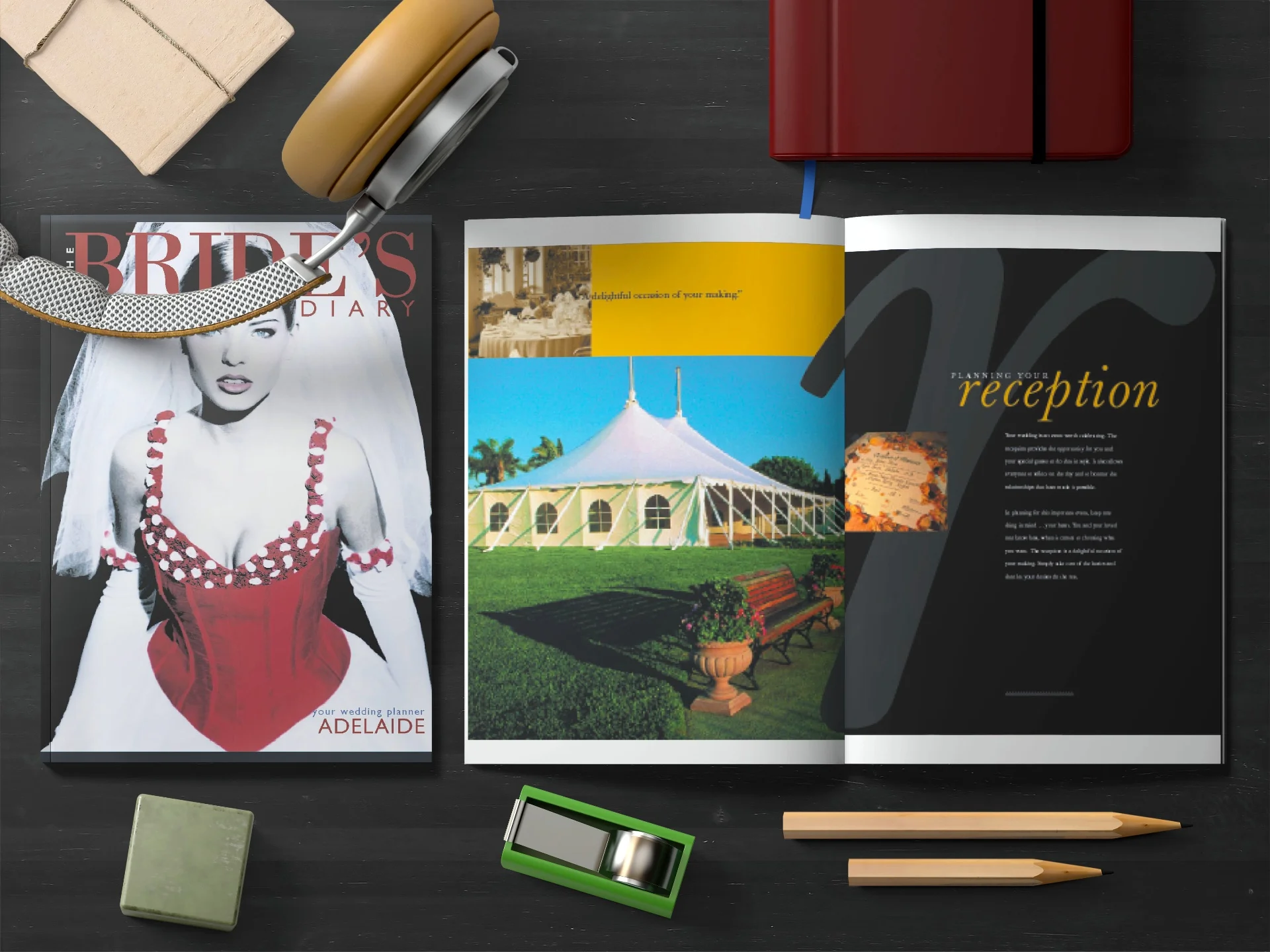
Redesigning The Bride's Diary Magazine: From A5 to Australia's Leading Bridal Publication
The Bride's Diary is one of Australia's most recognised bridal publications — a trusted resource for brides-to-be across every major capital city and beyond. But the magazine as it exists today is very different from where it started. This is the story of how we redesigned it from a compact A5 hardback diary into a premium, large-format editorial publication that became the benchmark for Australian bridal media.
1. Introduction — The Bride's Diary and Worsthorne Pederson Publishing
The Bride's Diary was originally published by Worsthorne Pederson Publishing — now known as Freyja Media. The publication had built a strong reputation as a practical planning tool for engaged couples, combining venue directories, planning checklists, and editorial content into a single, handy guide distributed across bridal expos and wedding venues throughout Australia.
What made The Bride's Diary unique was its regional approach. Rather than producing a single national edition, the publication was tailored to specific markets — each edition featuring local venues, suppliers, and editorial content relevant to that region. This hyper-local strategy gave the publication an edge that national competitors couldn't match.
2. The Original A5 Hardback Format
The original Bride's Diary was an A5 hardback — compact, practical, and designed to be carried in a handbag. It functioned more as a planner than a magazine, with diary pages, checklists, and small-format advertisements for wedding suppliers. While it served its purpose well, the format had inherent limitations.
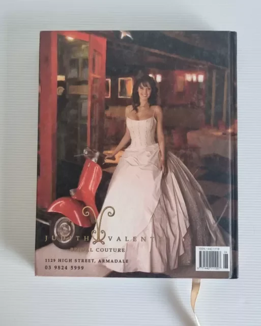
The original A5 hardback format — functional but limiting in terms of editorial scope and advertising impact.
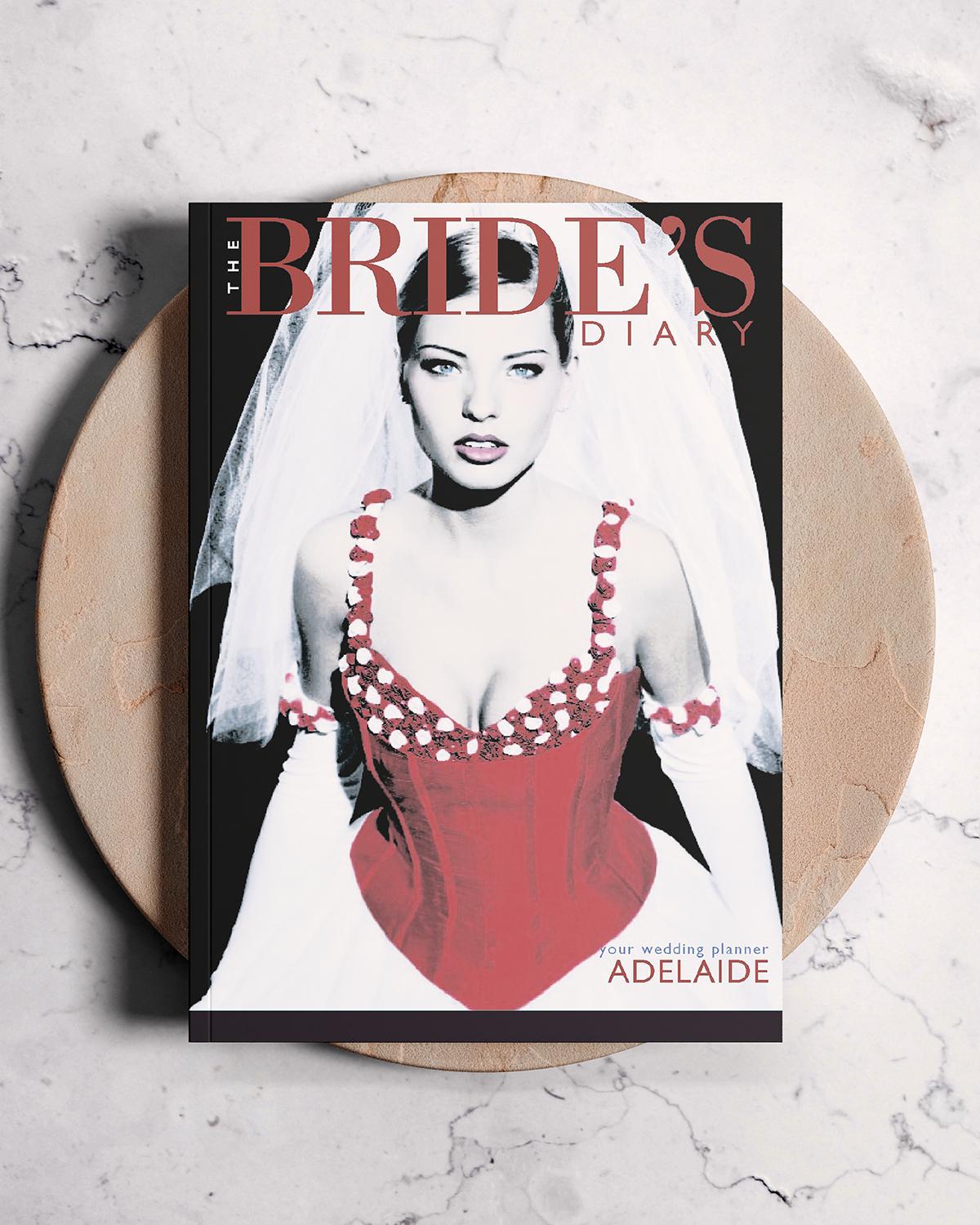
The 2002 Bride's Diary Adelaide Edition in a matte celloglaze finish
The small page size constrained the visual impact of advertising. Venues and suppliers investing in ad placements couldn't showcase their work with the kind of immersive photography and layout that the bridal industry demands. Editorial content was similarly squeezed — there was little room for the aspirational, lifestyle-driven storytelling that brides increasingly expected from wedding media.
3. The Brief — Evolving to a Modern Magazine Format
The brief from Worsthorne Pederson Publishing was clear: transform The Bride's Diary from a compact planner into a full-scale, large-format magazine that could compete with — and surpass — the established bridal publications in the Australian market. The new format needed to:
- •Deliver a premium, aspirational reading experience that matched the emotional weight of wedding planning
- •Provide impactful advertising placements that justified premium rates for venue and supplier clients
- •Maintain the regional customisation that was the publication's competitive advantage
- •Create a scalable design system that could be adapted efficiently across 8+ regional editions
This wasn't simply a matter of enlarging the page size. The entire editorial and visual identity needed to be reconceived from the ground up — new grid systems, new typography, new approaches to photography and layout, and a completely reimagined advertising framework.
4. Design Process — Art Direction, Typography & Layout Systems
The redesign began with establishing a cohesive visual language that could carry across hundreds of pages per edition. We developed a comprehensive design system covering every element — from masthead and section openers to feature spreads and classified advertising grids.
Typography
We selected a refined serif typeface for headlines and feature titles, paired with a clean sans-serif for body copy and captions. The typographic hierarchy was designed to guide readers through dense editorial content while maintaining an elegant, bridal-appropriate aesthetic. Drop caps, pull quotes, and carefully proportioned column widths gave each spread a sense of editorial authority.
Grid & Layout
A flexible multi-column grid allowed for varied layout compositions — from full-bleed photography spreads to structured venue directory pages. The grid was modular enough to accommodate the wide variety of content types: editorial features, venue showcases, supplier advertisements, planning articles, and real wedding stories.

Art Direction
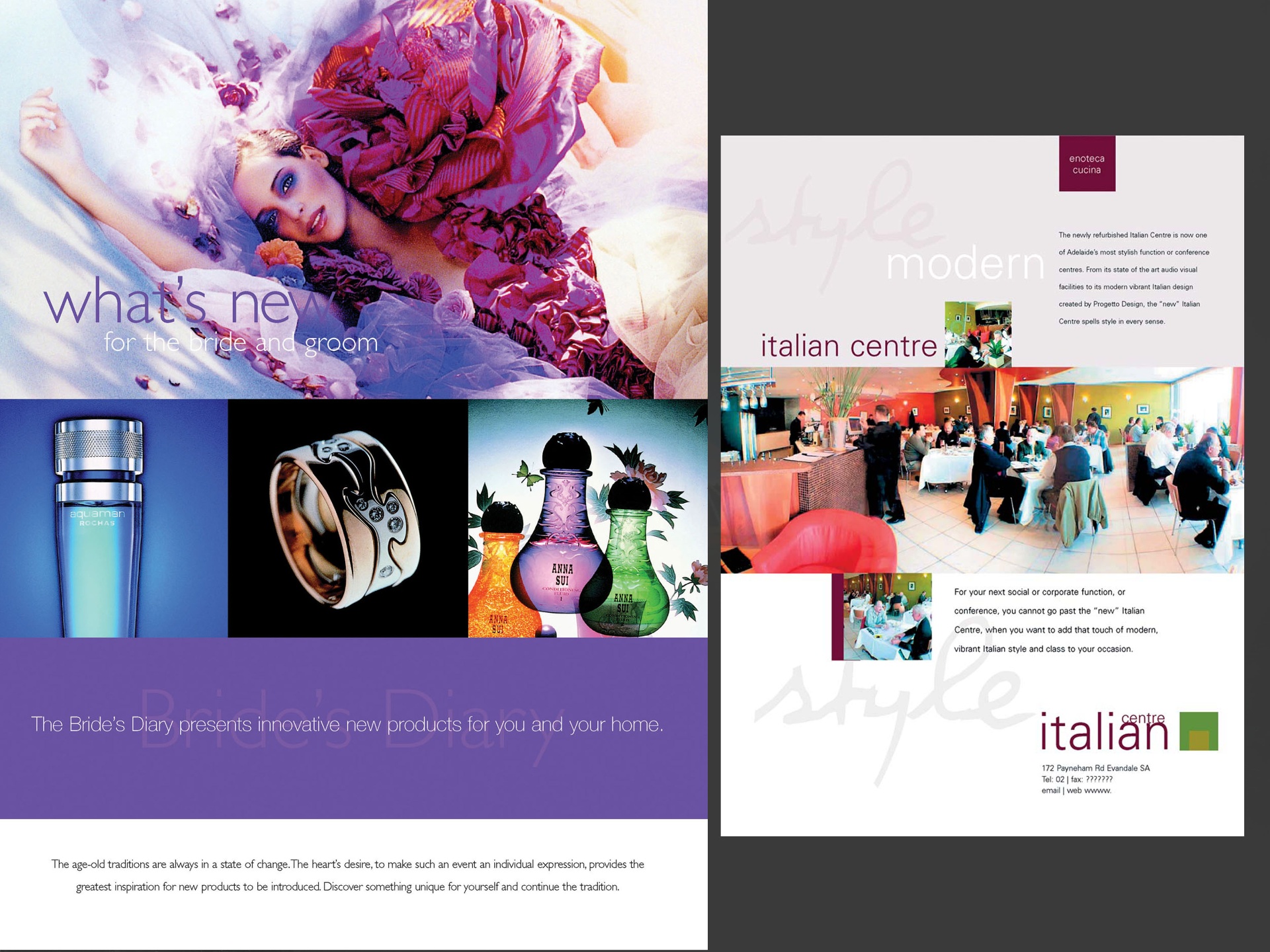
The art direction centred on a palette of soft neutrals, blush tones, and metallic accents — timeless enough to avoid dating quickly, while feeling distinctly bridal. Every spread was designed to feel curated and aspirational, whether it was a full-page venue advertisement or a planning checklist. The goal was that no page in the magazine should feel like an afterthought.
5. Ad Creation & Venue Partnerships
A significant part of the redesign involved creating advertisements for well-known bridal venues and suppliers within the publication. Unlike typical magazine advertising where clients supply their own artwork, many of The Bride's Diary's advertising partners relied on the publication's design team to create their ads — from concept to finished artwork.
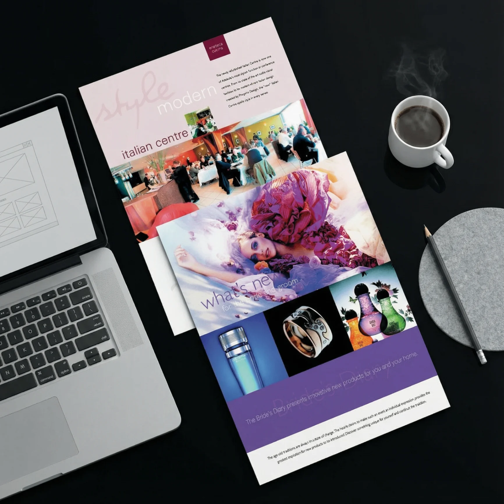
An example of a venue advertisement designed in-house for The Bride's Diary — art-directed to match the publication's editorial aesthetic.
This presented both a challenge and an opportunity. The challenge was maintaining visual consistency across dozens of different advertisers, each with their own brand identity and photography. The opportunity was ensuring that every advertisement in the magazine felt like it belonged — creating a cohesive reading experience where editorial and advertising worked in harmony rather than competing.
We developed ad templates at multiple sizes — full-page, half-page, quarter-page, and directory listings — each designed to maximise impact within the publication's grid. Premium placements like inside front cover, centre spread, and back cover received bespoke treatment, with custom layouts tailored to each advertiser's brand and photography.
6. Final Production — Prepress & Print
Producing a publication of this scale required meticulous prepress preparation. Each regional edition ranged from 200 to 300+ pages, with a mix of four-colour process printing and spot-colour elements for premium sections. The production workflow included:
- •Colour management: Calibrating imagery across different photographers and venues to ensure consistent reproduction on press
- •Preflighting: Rigorous checks on all supplied imagery, ensuring resolution, bleed, and colour space compliance
- •Imposition & proofing: Managing page imposition for web-offset printing with press-ready PDF output
- •Paper selection: Choosing a stock that balanced colour vibrancy with a tactile, premium feel — critical for a publication that brides keep and refer to throughout their planning journey
The scale of production — multiple editions running simultaneously — demanded precise project management. Each edition had its own timeline, content mix, and advertising roster, all converging on shared print deadlines.
7. National & International Reach
The redesigned Bride's Diary was published across eight regional editions in Australia, plus an international edition in South Africa:
- •Sydney — New South Wales
- •Illawarra & Southern Highlands — NSW
- •Canberra — Australian Capital Territory
- •Brisbane — Queensland
- •Adelaide — South Australia
- •Perth — Western Australia
- •Melbourne — Victoria
- •South Africa — International Edition
Each edition shared a common design framework and masthead identity, but featured region-specific editorial content, venue directories, and advertising. The South African edition required particular attention, adapting the design system for a different market while maintaining the brand's core identity. This international expansion demonstrated the scalability of the design system we'd built — the templates and grid structures worked seamlessly across cultural and geographic boundaries.
8. The Legacy — Freyja Media Today
Worsthorne Pederson Publishing has since rebranded as Freyja Media, and The Bride's Diary continues as one of Australia's leading bridal resources through bridesdiary.com.au. The publication has evolved with the digital age — the brand now spans print, digital, and social platforms — but the editorial foundation established during the redesign continues to inform its visual identity.
For Webfx2, this project remains one of our most significant editorial design undertakings. It demonstrated the full breadth of what a creative agency brings to publication design: not just layouts and typography, but strategic thinking about format, audience, advertising economics, and production workflow. The Bride's Diary redesign is a case study in how considered design can transform a publication's market position.
More Design Pages Coming Soon
We'll be adding additional photography and design spreads from The Bride's Diary Magazine to this case study — including editorial layouts, venue advertisements, and cover designs across multiple editions.
Need editorial design or publication art direction?
Whether you're launching a new publication, redesigning an existing one, or need art direction for a large-scale print project, Webfx2 brings decades of editorial design expertise to every brief.
Start a Conversation